For my second multimedia project, I was assigned to create a promotional poster using Affinity Designer. I chose Pepsi as the main product and designed a modern, eye-catching poster with a simple layout and bold typography. Before I started designing, I collected the product image, selected a suitable color palette based on Pepsi’s brand identity, and planned the composition. Overall, I spent around four days completing this project from start to finish.
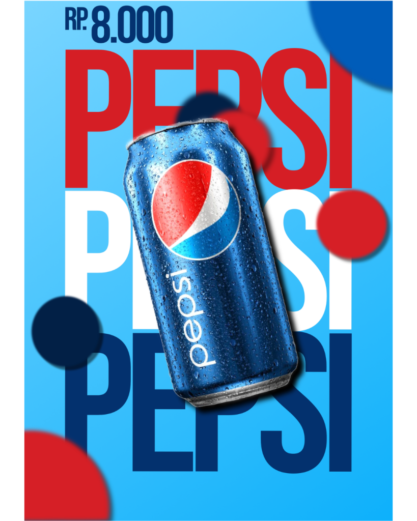
I created the poster step by step. I first designed the background using a light blue gradient to match Pepsi’s colors. After that, I added the large “PEPSI” typography in different colors to create depth and make the design more attractive. Next, I placed the Pepsi can in the center, adjusted its angle, and added a shadow to make it stand out. Finally, I included the price at the top and added several colored circles around the poster to give it a more dynamic and balanced appearance.
While working on this project, I would not say that it was easy, but I also would not call it very difficult. The most challenging part was arranging all the elements so that the poster looked clean without feeling empty or overcrowded. Even so, I enjoyed the design process because I learned more about composition, typography, color harmony, and visual balance. This project also helped me improve my creativity and taught me that a simple design can still be effective when every element is carefully planned and placed.